Diese Case Study ist auch auf Deutsch verfügbar
Rental cars need not be expensive! Booking a rental car for €1? That sounds too good to be true. Eustach von Wulffen and Karl Markiewicz want to do just that with their start-up Movacar. But how is this supposed to work?
Because of future customer reservations, rental car companies often have to transport their vehicles from one location to another. For instance, one customer may have reserved a rental car for pickup in a Hamburg branch in five days. If the planning shows that no vehicle will be available there at that time, the provider has to transport an appropriate car from another location to Hamburg. In the ideal case, a paying customer will be found, who will drive a car there in the course of a completely normal rental.
But what if no such trip is scheduled? In that case, the rental car provider must handle the transport at its own cost. Normally, an external company is hired for the purpose and receives a corresponding fee. That is exactly where Movacar comes in: Instead of doing an “empty run” at the cost of the rental car company, Movacar would like to make such trips available to a cost-conscious user group as “last minute offers”, passing the savings of the rental car company on to the customer.
From initial talks to joint Design Sprint
The contact between Movacar and INNOQ was made via the Factory Berlin network. After an initial call and a personal meeting, in which Eustach and Karl introduced Movacar, we realized that it was not just the idea that we liked, but also the entrepreneurs themselves. Both of them had previously worked in management positions for a large rental car provider, so they know the material inside and out. They know about the logistical problems that have to be solved. And they know who they need to talk to at the rental car provider; and how to do it. All in all, the best business prerequisites for the young start-up. What was missing was the technology.
In the context of our “Tech4Equity” program, we want to provide technological support for start-ups we like. In return, INNOQ gets a share of the new company. In order to get a good picture of the idea to be implemented and its business potential, but also to get a better impression of the possible partners, we discovered the Design Sprint process of Google Ventures entdeckt.
Whereas “classic” product development can take many months from idea to the first real user feedback after launch, the defined process of Design Sprint helps cut the time to a few days. The basic principle is to get all the essential decision makers and knowledge holders together to work creatively on a jointly defined problem. In this process, it is important for as many areas of the company as possible to contribute knowledge to the Sprint. On the other hand, it is also important that such a working group not get too large. In our experience, the coordination effort already begins to expand disproportionately with more than eight persons. However, in order to submit a presentable prototype on the final day, one that can be used to get real user feedback, it is necessary to adhere to a tight, but not stressful, schedule. After we had clarified the formal matters, discussed the composition of the team, and had all cleared our calendars for a week, we were ready to begin. So just what does a Design Sprint look like?
Day 1: Understanding
On the first day, the Sprint goal is defined. However, it is not simply provided. Instead, the goal is to reach a joint decision in a manner that is transparent and understood by all. (Of course, there is also the role of decision maker, who can decide “against the team” in case of doubt. However, because of the high level of transparency, the chances of this occurring are slim to none.)

In order to define the content and scope of the prototype, the following questions and steps are helpful:
Long-term goals
What are the mid-term and long-term goals of the company?
Sprint questions
What are possible problems that could keep the company from reaching these goals?
Ask the experts & How might we
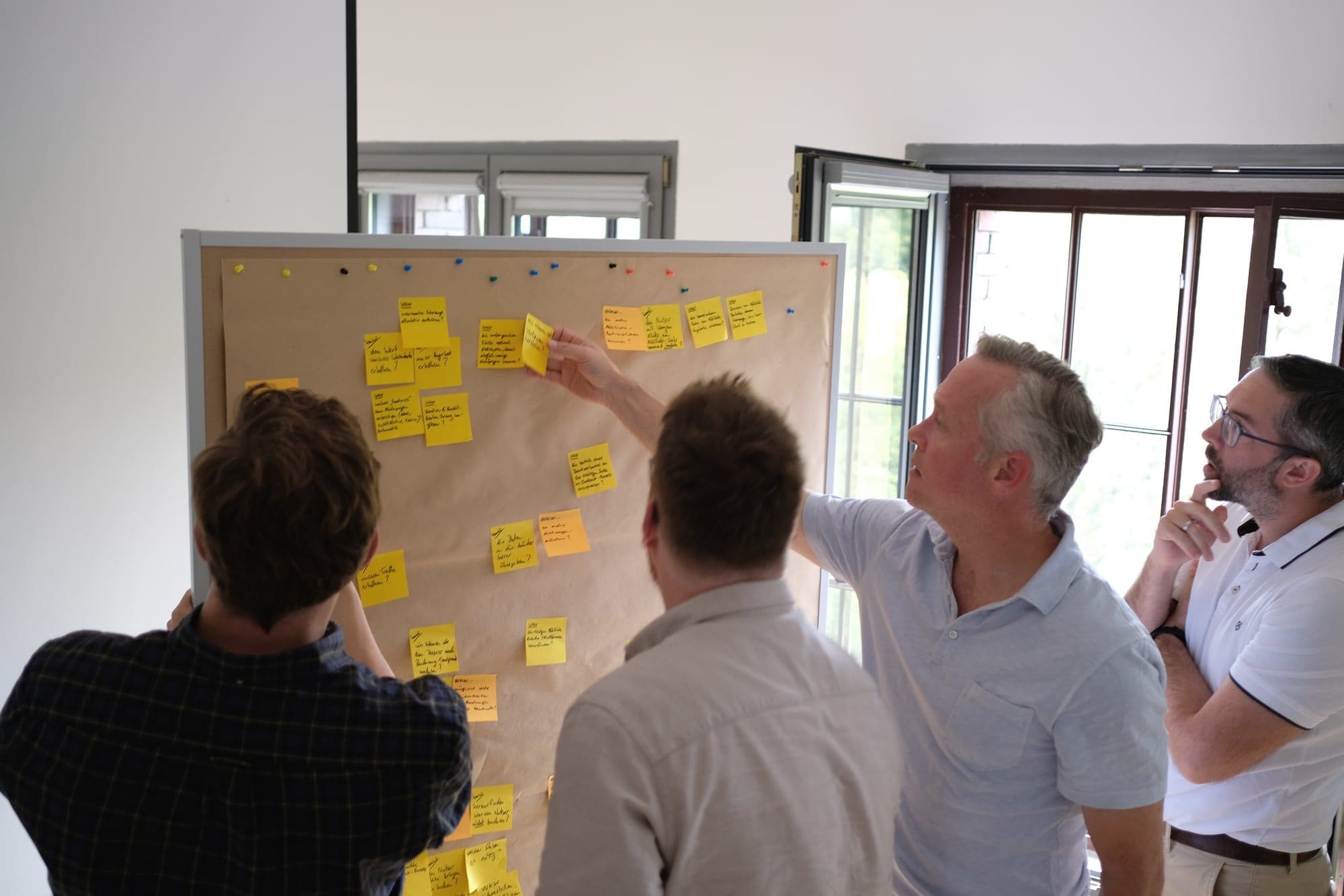
Here, the team members ask previously uninvolved persons how things currently work and why they are the way they are to identify problems and make notes of “How might we” questions in the form of Post-its. These questions help you to think in solutions instead of problems.
User Experience Map
The User Experience Map (UX Map) is first used to identify all the participants in a business process. This can include both internal and external persons or groups of persons. Then all the necessary actions of the participants and their interrelationships are worked out.
Now the previously weighted “How might we” questions are hung up on the UX map. This shows very clearly the parts of the process on which the team should concentrate. This can be either a completely new subprocess, one that does not yet exist, or an already existing one.
Lightning Demos
Based on the identified subprocess that is to be examined in the Design Sprint, each team member looks for examples that, in his or her opinion, can be implemented particularly well or contribute a new aspect.
Four Step Sketch
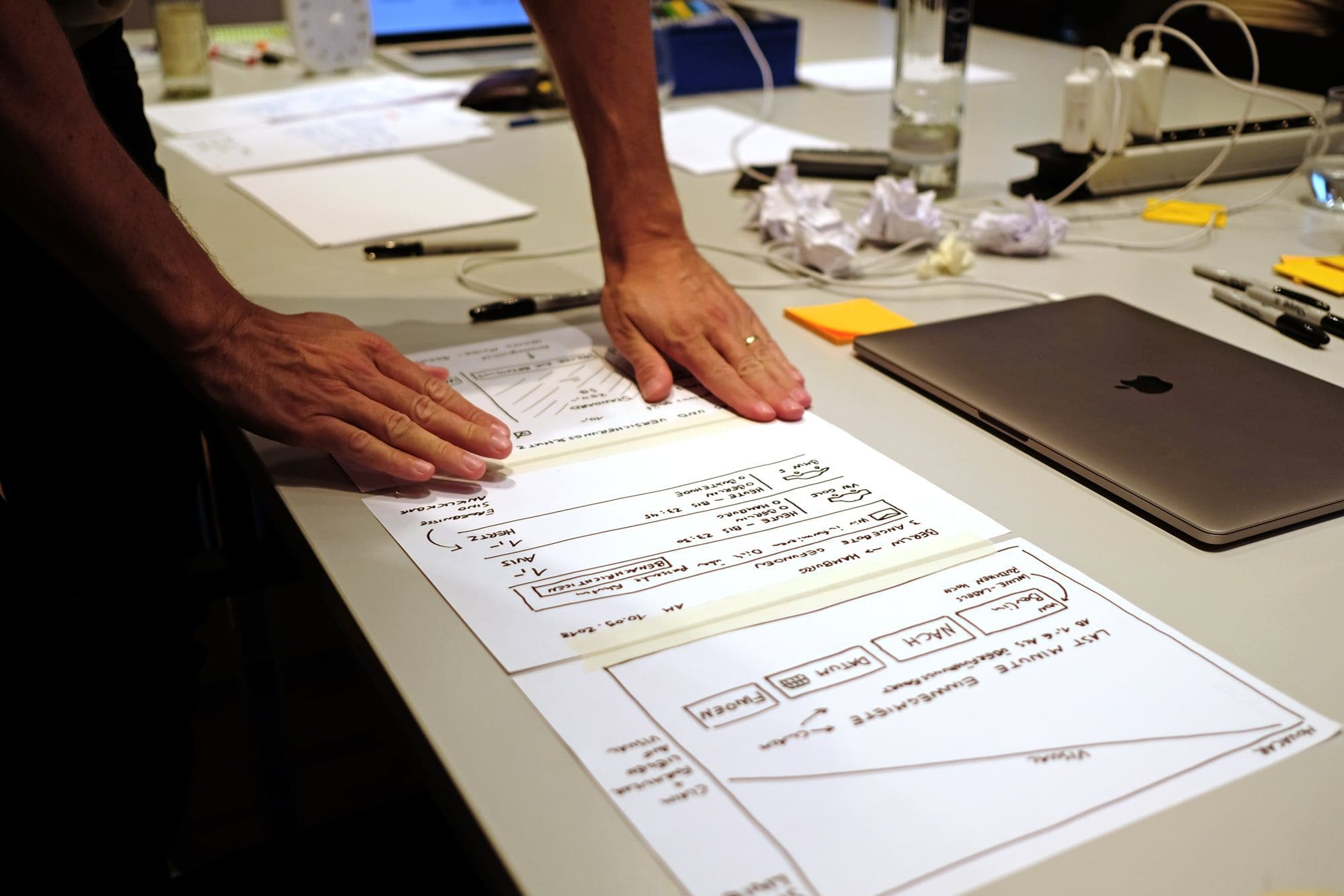
At the end of the first day, each team member uses his or her impressions up to that time to develop an initial solution for the prototype on paper. For example, this could be a revised check-out process for an online shop. The solution must be as self-explanatory as possible, so that all the others can put together the best ideas the next day.

Day 2: Conception
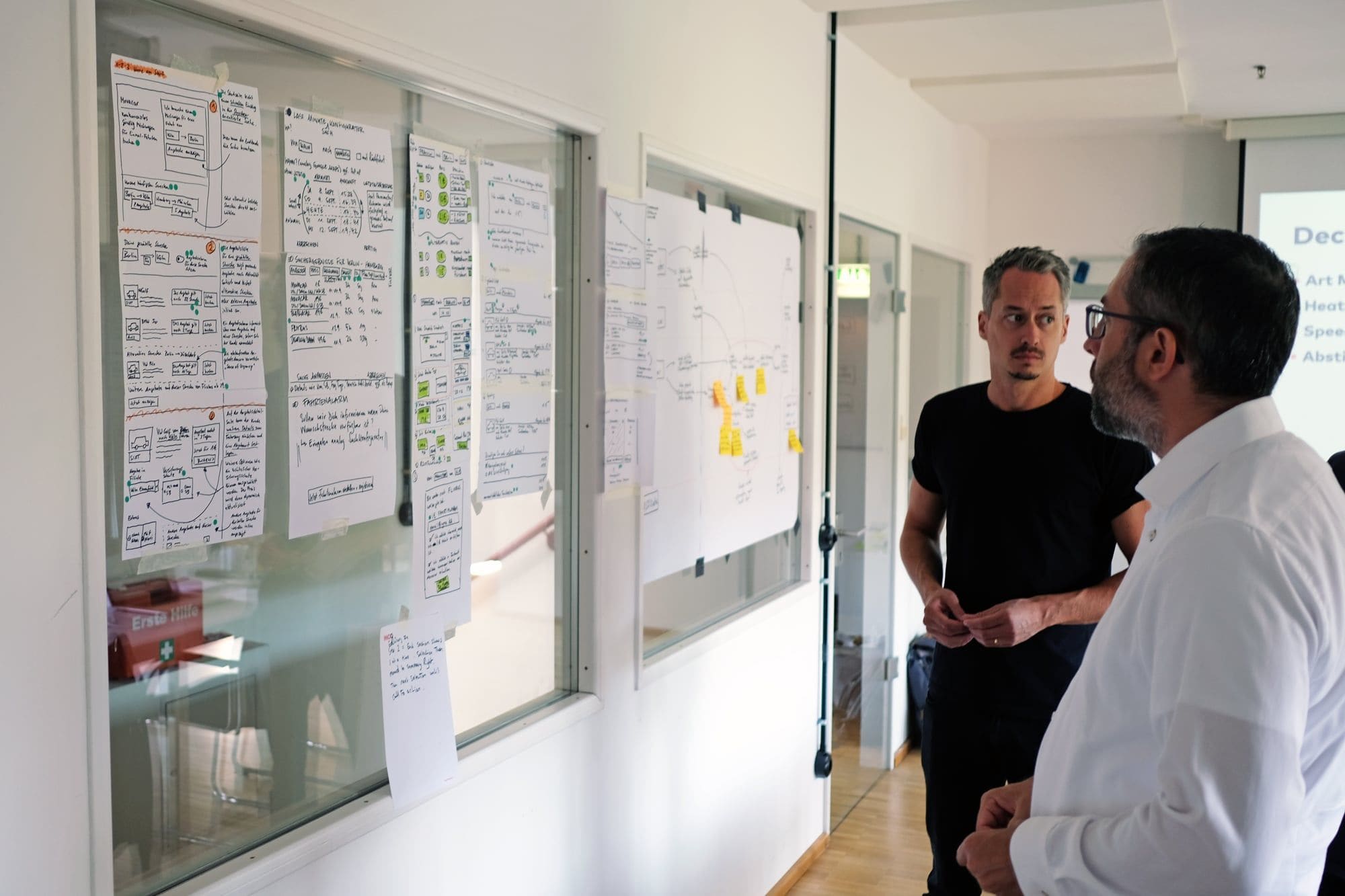
After each team member has developed his or her own idea on paper, the best one is selected by voting. Mainly, this selection determines the basic direction in which the team should continue. If very similar approaches were developed, partial aspects of other proposals can also be pursued.
Next, in order to find the screens to be created for the prototype, each member develops a “User Experience Flow” (UX Flow), consisting of six steps. Here, too, the best approaches are again selected by voting and placed in order. The UX Flow is thus the basis for a storyboard of about eight screens, which is prepared by the end of the day. This storyboard clearly defines the scope of the prototype.

Day 3: Creating the Prototype
At the beginning of the day, the various roles for creation of the prototype are assigned (designer, copywriter, et cetera), along with a suitable tool. So far, we have had very good experience with Figma. As a Web-based tool, Figma facilitates collaborative working among all participants.

Day 4: Testing
This is the day everyone has been working toward and looking forward to! How will the idea be received? Will the users understand what we’ve come up with? What haven’t we thought of in our design?
While one part of the team was building the prototype the day before, a user test was also being developed at the same time. In addition to an interview guideline for the user, a feedback sheet was also developed to help record the subjective impressions of the observers in a uniform manner, preferably in digital form. You can find more about our experience and recommendations for technology here.
It is always interesting to see how the individual users react to the prototype that is created. Often, there are very different expectations and priorities, some of which were never even thought of by the team in advance. In the subsequent internal discussion within the team, it is not uncommon for questions and topics to be identified for the next Design Sprint. For us, this is the best feedback, showing that the process is effective, leads to valuable results, and is also fun.

Lessons learned
As always, of course, there are things that can be done better. For instance, it is always advisable to ask more people to do the test than are actually needed. Particularly when someone does not provide feedback on time, it can be assumed they have forgotten and a “replacement” is needed.
Nevertheless, in designing the prototype, separate screens should be used consciously as placeholders. For example, it is always irritating when a user in a booking process expects to enter his payment data, but it is not requested. In order to ensure that the overall process is nevertheless clear, such steps expected by the user should be integrated with a short explanation, even though they do not actually function. Likewise, the team should express their gratitude to the testers. The giveaways handed out by Eustach and Karl at the end of the test, in the form of Movacar cups, chocolate, and Amazon coupons, were well received by all.
And, last but not least, the success of a Sprint requires committed and motivated people who are interested in learning something new in order to improve themselves and their product.
Thank you once again for this opportunity. We found this week very productive and the team was simply super.
Karl MarkiewiczFounder
