Diese Case Study ist auch auf Deutsch verfügbar
At INNOQ we like to organize regular company events with workshops and talks. Every other month the more than 150 colleagues of our nine locations in Germany and Switzerland meet up to exchange and learn. The open space method has proven to be particularly effective. This means that the participants themselves decide on the spot which topics will be talked about.

As since 2020 these events have only been able to take place online, the search began for a suitable planning tool. And a solution was quickly found with the online whiteboard Miro. The problems only emerged once we started using it. The well-known online whiteboard tools offer a great, interactive experience – but only for people without visual impairment. As a result, a blind colleague who is reliant on a screen reader was completely excluded from the application. This was a disadvantage that we could not reconcile, either with our aspiration for universal design or with our digital know-how.
As developers we have the responsibility of writing web applications that are accessible for everyone. After all, this is the internet. It is possible to write universal-design applications. So why aren’t we doing it?
Joy HeronSenior Consultant, INNOQ
What Doesn’t Exist, We Can Develop
As a result, Joy Heron, Senior Consultant and accessibility expert at INNOQ, took the initiative to develop a suitable tool for online open space events. The idea of Spacy was born. In order to meet the basic requirements of universal design, the application had to fulfill a number of prerequisites. It had to be suitable for keyboards, mobiles and screen readers, and of course offer a pleasing and practical user experience for all users. The most important issue at the beginning was determining what was important and relevant. In other words, what has to be read out by a screen reader? This includes not only written information but also visual details. For Spacy was to be designed in a way that would be familiar to many users of other tools – notes were to be collated and presented on a board. Information such as “Which session takes place when and in which room?” was to be presented, or also the setting or changing of the user’s own sessions.
An appreciated side effect, which incidentally applies to the whole theme of accessibility, is that as a result of the additional information, the application is more user-friendly and understandable also for people without disabilities – in this case people without visual impairments. This is because all the information that is read out by the screen reader is also visually integrated.
Clear Structure in Focus
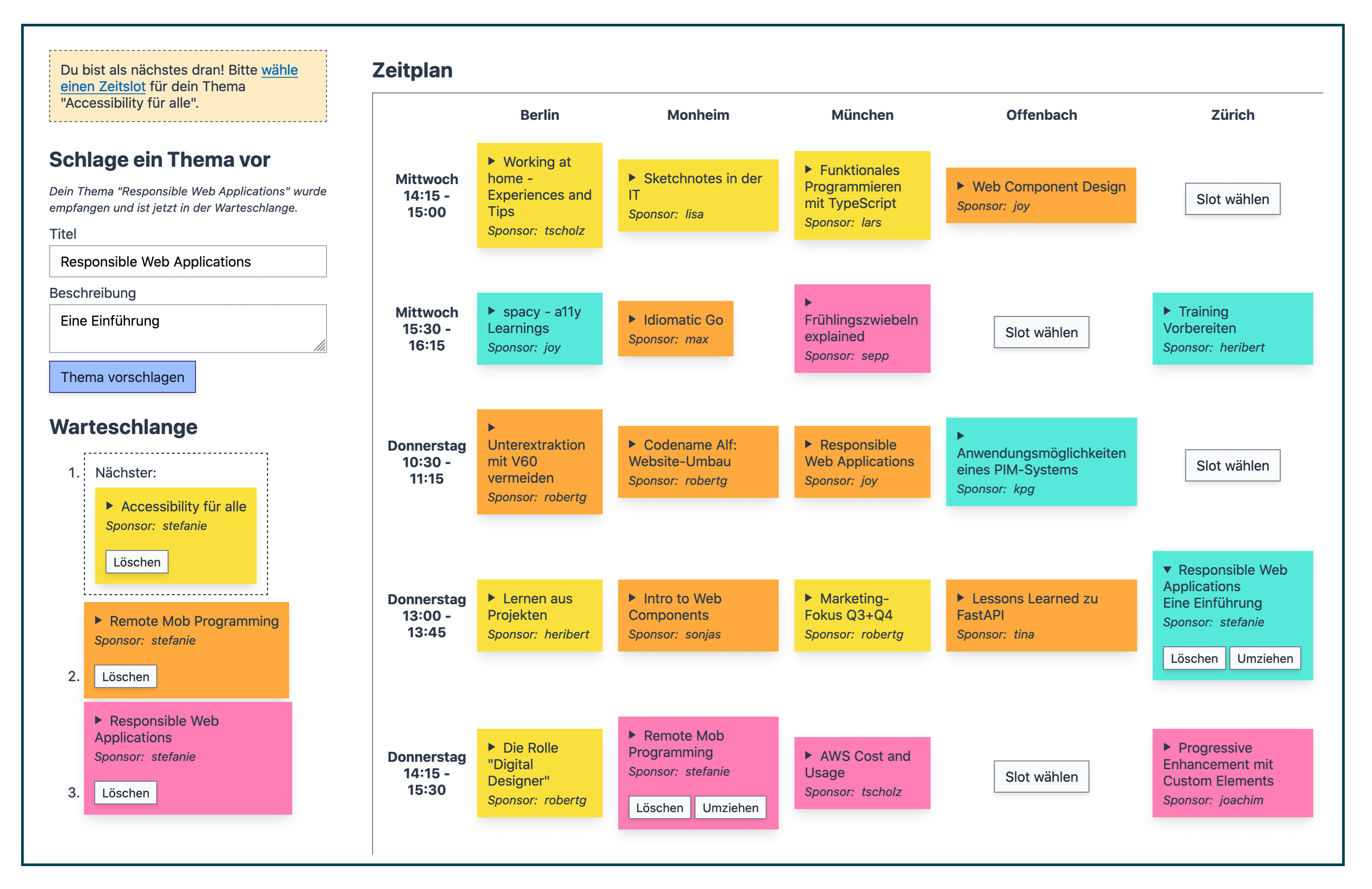
An important element of Spacy is the queue presented on the left of the screen. Here, users can suggest their sessions with title and brief description and arrange them in a list. Users can then place their sessions in the schedule one by one.

The schedule on the right of the screen appears in the form of a table and contains information on the location, day, and time. The sessions on different topics are placed here by means of differently colored notes. When scrolling through the table, in each row first the corresponding room and then the corresponding time is given, without having to switch to the head of the table each time. This is especially useful for users reliant on a screen reader. If however the user scrolls within the same column (i.e. the same room), they receive the information on the corresponding time slot first. They can then decide whether they want to hear this information or to skip it.
For the purposes of universal design, in the current version of Spacy the notes are not placed by means of drag and drop. Instead, there are buttons directly in the table that can be operated by clicking or with the keyboard. Screen readers and other assistive technologies are better able to deal with this function. However, an additional drag-and-drop function has not been ruled out for future versions, and is in fact desirable in the context of the progressive enhancement philosophy. After all, Spacy should offer the best possible experience to all its users.
We‘d love to show you a YouTube video right here. To do that, we need your consent to load third party content from youtube.com
Read and Be Read
The user interface follows the typical requirements of a digital open space event – and of course those of accessibility. Different HTML attributes were therefore chosen, for example the use of an HTML list for the queue. Screen readers are able to easily read out contextual information from here, such as how many sessions are currently in the queue. With the help of ARIA (Accessible Rich Internet Applications), which is implemented in most browsers and screen readers, and in particular with the “Live Regions” function, live content updates, such as changes to the schedule, can be read out.
Closely connected to the UI is the database behind it. Jan Stępień, Senior Consultant at INNOQ, took on this part and decided on Crux, an interesting bitemporal database model. All transactions that take place within the application history are saved there. This simplifies error analysis, for example. In addition, the sessions are saved in the database as structured documents. It therefore reflects 1:1 what is seen in the UI.
Another aspect important for universal design is the navigation. A <nav> HTML element is used for this, with which the user can jump to the different fields of the page. Spacy should meet the requirements of screen reader, keyboard and mobile-device users equally, not only from a technological perspective but also with regard to ease of use and good orientation. An example is the placing of sessions. So that users always know where on the website they must navigate to next, a link to the table is given in multiple locations. With the screen reader for example, users can then navigate within this table with the arrow keys and get to the buttons with the available time slots. The links improve the UX for all users, for example because the link is also displayed on a mobile device when one can only see part of the screen.
Many of the details that improve accessibility were only discovered in the testing phase. One possibility is to test the application with a screen reader during the development phase. However, it is even better if a program or website is tested by the affected people themselves. Joy Heron was therefore supported in the final approval stage by our blind colleague, Andreas Maier. He identified slight weaknesses in the structure, such as redundancies or missing information.
I’m not disabled, I’m impaired. Unless you put obstacles in my path.
Andreas MaierSenior Consultant, INNOQ
His feedback resulted in further important improvements. For example, in one of the early versions of Spacy, users had to choose a display name before they could suggest and place a topic. To do so, they clicked on a link, entered the name, and then returned from there back to the application. For screen reader users, this form of navigation was confusing. Joy therefore decided to integrate the INNOQ SSO. As a result, after logging in all users were automatically signed in with their display name and could enter the details of their session straight away. The use of ARIA Live Regions was also the result of feedback from Andreas that changes in the queue, for example the successful placing of his session, could not be read out by the screen reader.
