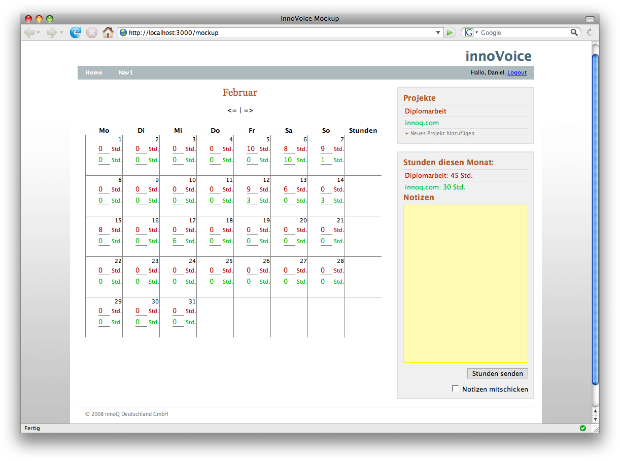
The second mockup of the applications UI. I thought I stick to the design of innoq.com, so co-workers are somehow familiar with the layout. The (div-)structure underneath is quite different than the one of innoq.com, but I copied some design-elements so far.
Take a look:
In the top-right corner you now have the ability to add one or more projects you’re currently working on. They’ll be differentiated by colors. In the calendar you’ll find the corresponding fields for these projects. Again: I think I’ll hide most of these field in normal view, using an in-place editor.
I’m still really curious what your opinion is…

 Hi. I'm Daniel Pietzsch and this is my innoQ-Blog. I'm a 26y old student at
Comments (2)
Looks very nice. What is the "Stunden"-column for?
The Arrows for next/previous month should in line with the name of the actual month. And they should not contain a "=" or be little images, but that are just details.
Good job!
Posted by Gerald Schenke | 27.02.08 16:33
Posted on 27.02.08 16:33
The "Stunden"-column was meant to be for a summary of worked hours for each week.
In the current (unpublished) version of this mockup I already removed this column, because I think it's not really necessary due to the fact that you see the sum of all hours of the month in the sidebar.
And I also replaced the text-arrows by names of the months. Like this:
You'll see all these changes in the next mockup I post...
Thanks for the comment! It seems like you often share my thoughts... ;-)
Posted by Daniel | 27.02.08 18:27
Posted on 27.02.08 18:27