As far as Unified Process is concerned, I already clarified some of the Business Modeling and Requirements a few month ago. See my blogposts here and here.
Well, I think I had a flash of inspiration: in order to “get real” I decided to start with the project. Isn’t that great?
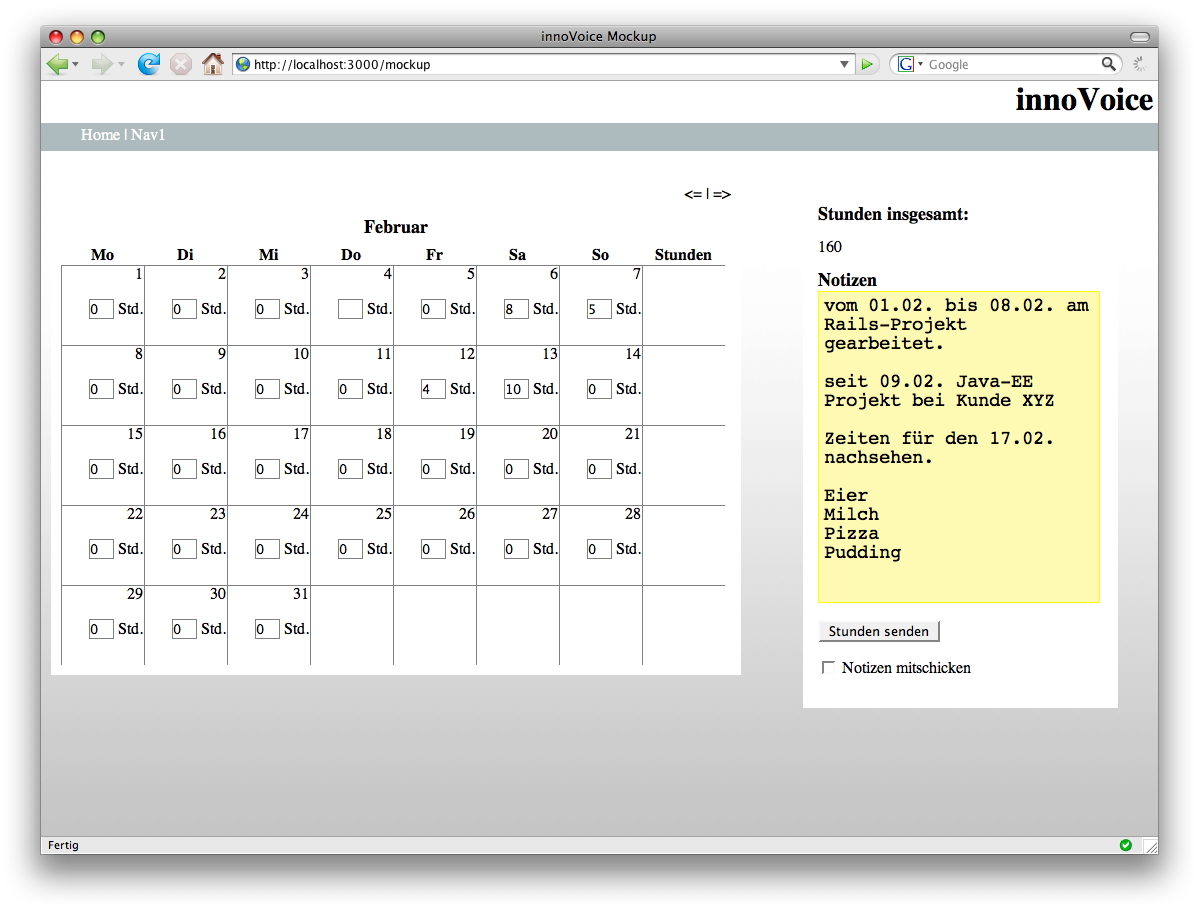
And I decided to go with the UI first, because the first thing that comes to my mind is how the app will roughly look like. As a working title I called the app “innoVoice” (Yeah, it really is a great pun *cough*)
There you go:
That is the first screen for the colleagues out there in customer-projects for doing their time-reporting.
Ok, it is still made up of standard fonts, there are no fancy graphics etc., but I think it represents the image I have in mind when I think of that part of the app.
What bothers me a bit are all the input fields in the calendar. I think I’ll hide them using some AJAX in-place editors, so they won’t be that distracting.
I don’t really know what will be next. Either I start implementing this feature or I go for another UI-mockup. Maybe I’ll know more in one hour or so…
Stay tuned and feel free* to comment on the UI-mockup!
*actually, I would force you to comment, if I could!

 Hi. I'm Daniel Pietzsch and this is my innoQ-Blog. I'm a 26y old student at
Comments (5)
Nice. Note that any one employee may be working on two or three projects simultaneously - not sure how this would be handled with this UI.
Dealing with the many input fields: similarly to iCal, a field could be created only after the user has clicked into a particular day cell.
It's definitely a great idea to start with UI mockups.
Posted by Stefan Tilkov | 18.02.08 22:43
Posted on 18.02.08 22:43
I think for your web-app is getting real a good approach. Because is the ui bad the user thinks the whole system is bad :). By the way i like the first mockup.
Posted by Tim | 19.02.08 15:36
Posted on 19.02.08 15:36
Ok, thanks for your comments.
That was one question I had. This is definitely not handled so far.
That's exactly what I had in mind.
Posted by Daniel | 20.02.08 12:59
Posted on 20.02.08 12:59
i guess the notes on the right site are for the whole month. Will it be possible to add notes for every single day? (e.g. "Today i was really lazy and did nothing at all except writing this note!") :D
I like the layout so far. Perhaps you should consider to color the weekend-columns?
Nice work. Keep going!
Posted by Gerald Schenke | 20.02.08 16:12
Posted on 20.02.08 16:12
Yes, the notes to the right are for the whole month. So far I think that's enough, because it is intended to be mostly for personal use. And hey: you know when you've been lazy... ;-) And I think this wouldn't add any useful information when it comes to invoices.
Yes, and I will color the weekends, as I'll still have to style the calendar. So far it's just a fake anyway...
Posted by Daniel | 21.02.08 17:24
Posted on 21.02.08 17:24